The Palette of Peace: How Colors Cultivate Calm in Your Space
The foundation of a peaceful palette often begins with the serene embrace of cool colors. Hues like soft blues, gentle greens, and muted lavenders are intrinsically linked to calmness. Blue, evocative of the sky and still water, is renowned for its ability to lower blood pressure and slow the heart rate, promoting a sense of restfulness and mental clarity. Green, the color of nature and renewal, offers a restorative balance, easing anxiety and fostering a connection to the natural world. These colors work by minimizing visual stimulation, allowing the eye and the mind to rest. However, the specific shade is critical; peaceful rooms benefit from muted, grayed-down, or pastel versions—think sage, dusty blue, or seafoam—rather than their vibrant, primary counterparts, which can feel energizing or cold.
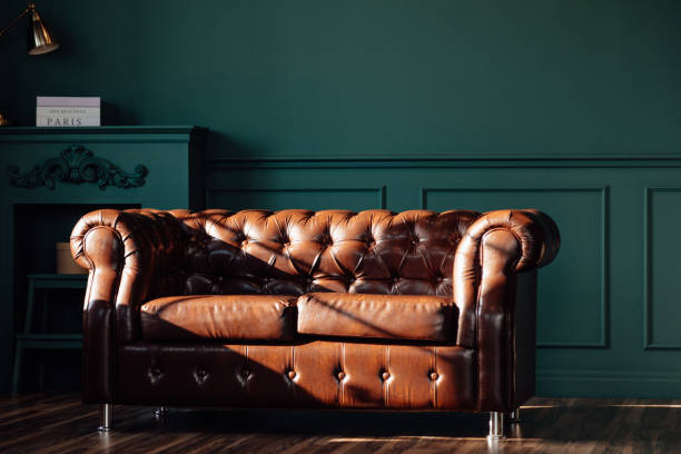
Equally important in the architecture of calm are the soft, warm neutrals. While cool colors soothe, an over-reliance on them can risk creating a space that feels sterile or emotionally distant. This is where the gentle warmth of off-whites, creamy beiges, warm taupes, and soft greiges comes into play. These colors provide a grounded, enveloping feeling, like a soft blanket for the walls. They reflect light beautifully, making spaces feel airy and open without the starkness of pure white, which can sometimes feel clinical. These neutrals form a perfect, non-invasive backdrop, reducing visual noise and creating a sense of unity and spaciousness that is fundamental to peace. They allow other elements in the room—a textured throw, a piece of art, a living plant—to shine without competition.
Beyond simple hue selection, the principles of harmony and subtlety are paramount. A peaceful room avoids high-contrast, jarring color combinations. Instead, it employs tonal schemes, where colors exist within the same family or saturation level. This monochromatic or analogous approach creates a seamless, flowing visual experience that feels cohesive and intentional. Furthermore, the 60-30-10 rule is a useful guide: a dominant neutral covers 60% of the room (walls, large furniture), a secondary calming hue accounts for 30% (upholstery, curtains), and a mere 10% is reserved for a subtle accent color, perhaps a slightly deeper shade of the secondary color or a muted earthy tone like terracotta or ochre for gentle warmth.
Ultimately, the role of color in creating peace is deeply personal and contextual. Cultural associations, personal memory, and the quality of natural light in a room all influence how a color is perceived. The overarching goal is to choose a palette that feels retreat-like to the individual, one that minimizes arousal and maximizes rest. By thoughtfully selecting colors that whisper rather than shout, that harmonize rather than clash, we can design rooms that do more than house us. We can create environments that actively nurture our well-being, using the subtle, profound power of the palette to build a daily refuge of calm. In the end, a peaceful room is painted not just with pigment, but with intention, allowing color to perform its quiet magic on the mind and spirit.
Related Articles
Learn more about Your Surroundings and People.